
When the Interlynked team reached out to me, they had a clear vision: make wildfire data feel actionable — not academic. It wasn’t just about aesthetics; this site had to build trust, explain a technical product clearly, and prompt users to take action fast. Here’s the step-by-step of how we brought it to life.
If you’re building for govtech, climate, or SaaS — or just curious about my process — this breakdown shows how I go from client calls to final pixel.
Phase 1: Understanding the Problem
Client Calls, Product Demos & Research
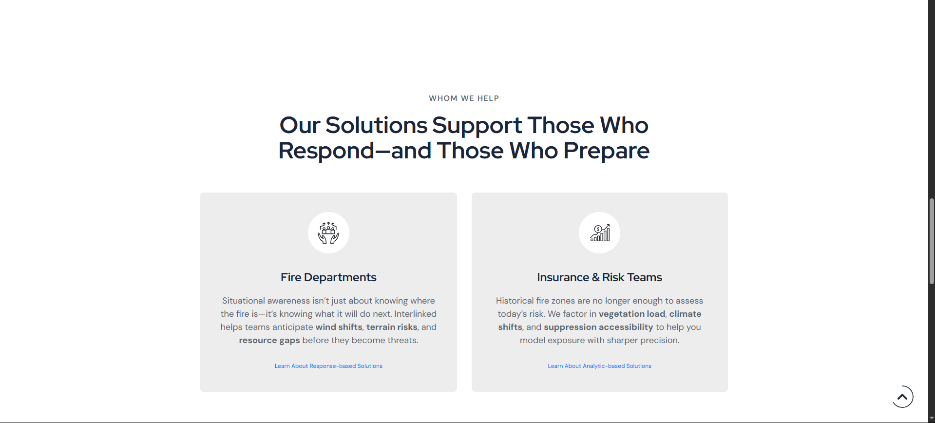
Before touching any design tools, I spent time with the Interlynked team on Zoom, understanding who their product serves: emergency responders, insurance analysts, and state agencies. I asked questions like: What problems do users face right before they land on this site? What should they believe or understand within 15 seconds of landing?
Phase 2: Structure First, Then Style
Wireframes in Figma
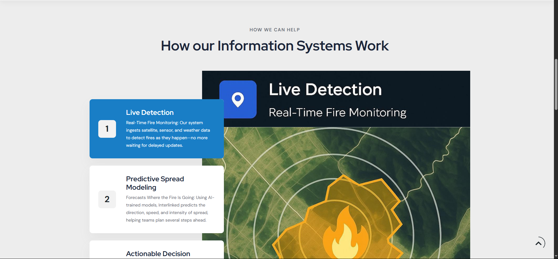
My first drafts focused purely on hierarchy and flow. How does someone land on the page, scroll through a few sections, and leave feeling confident? The top sections had to communicate urgency (wildfires move fast), while the bottom half needed to handle objections and explain differentiation.
Clear Call to Actions — Not Just Pretty Design
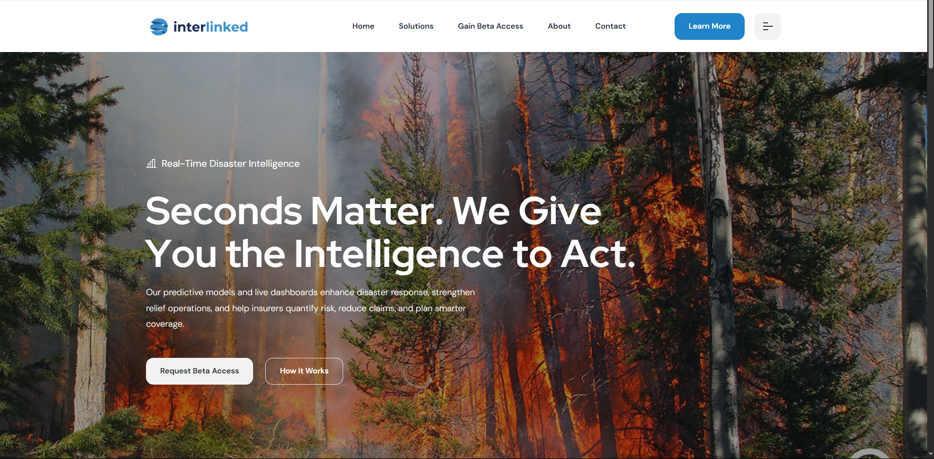
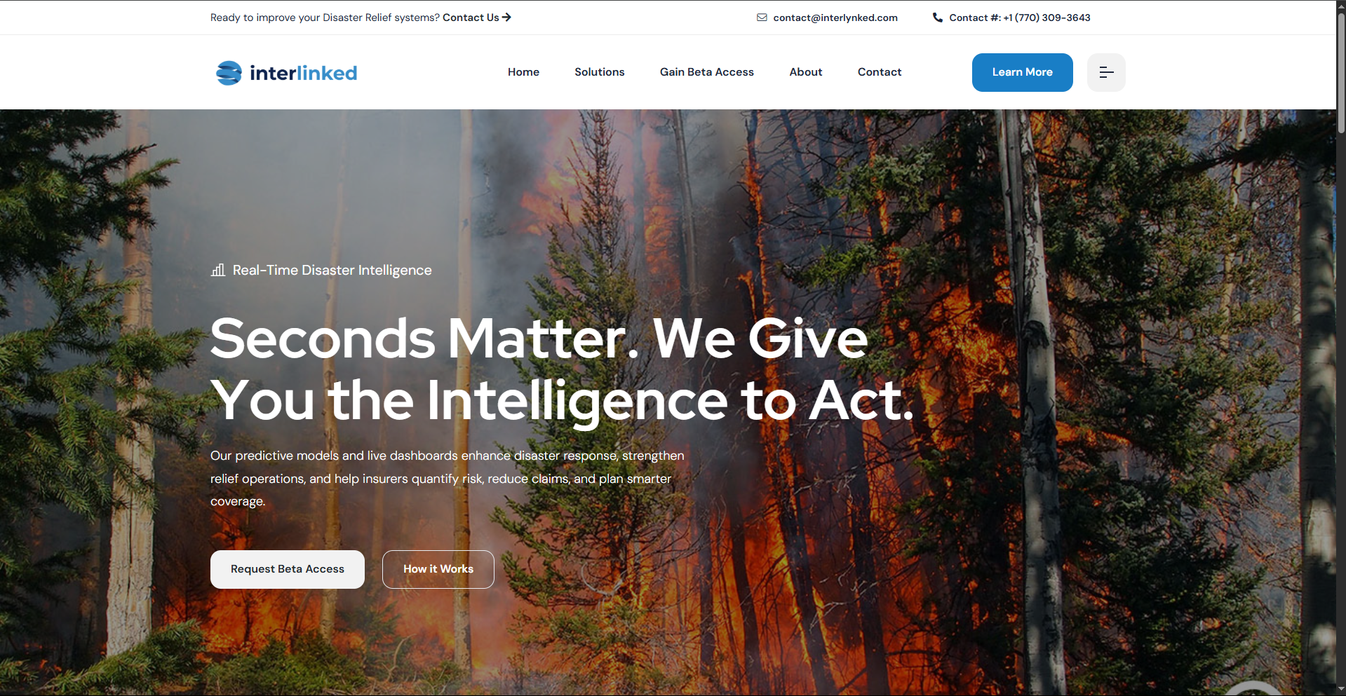
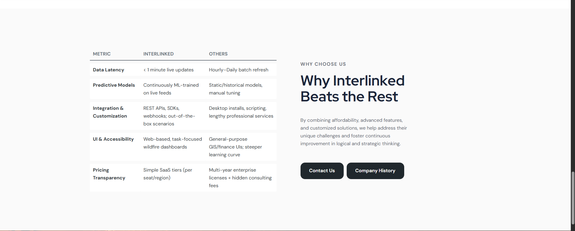
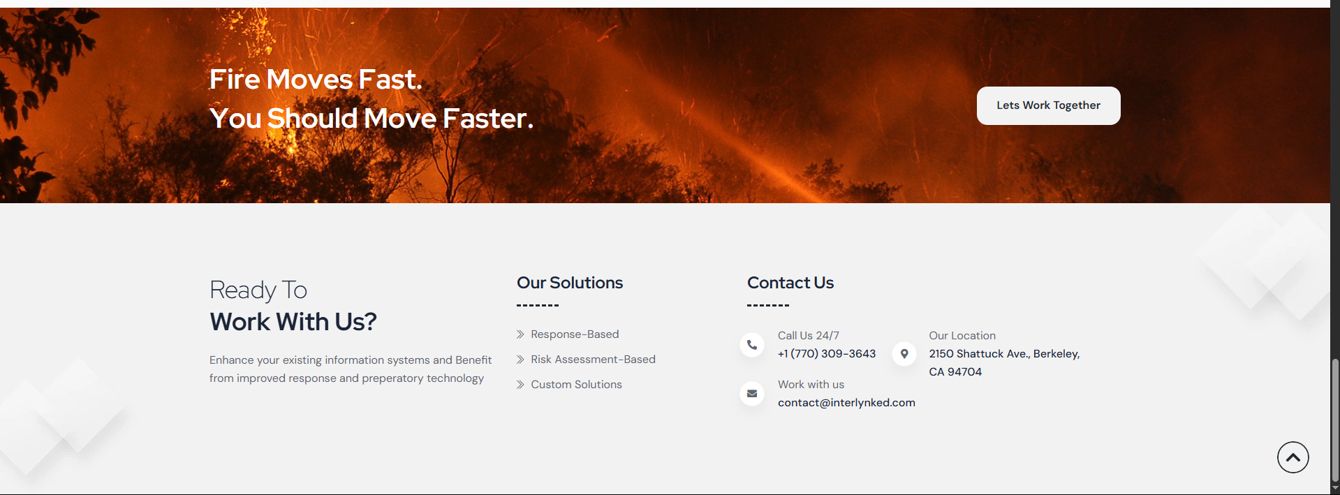
The goal wasn’t to look good. The goal was to convert. I designed with conversion in mind: multiple CTAs, strong “Why Us” table, and a clear email & phone number in the nav bar. We even tested phrases like “Fire Moves Fast. You Should Move Faster” vs more passive ones — the former won by far.
Phase 3: Building the Site
Responsive, Fast, and Easy to Update
I used clean HTML, CSS, and minimal JS to keep the load times low. We went for a flexible layout that adjusts to new products, states, and data types — future-proofing the site while staying lightweight. Accessibility was a priority too — legible fonts, alt tags, contrast checks, and keyboard nav.
Phase 4: Feedback, Iteration & Shipping
Fine-tuning Copy and Microinteractions
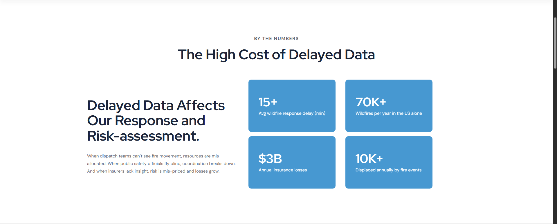
We tweaked everything — from hero text to hover states. One major insight was simplifying the product explanation. Originally, the client wanted to go deep into fire models and ML training, but we realized decision-makers care more about outcomes: faster evacuation, lower insurance losses, real-time alerts.
Final Touches
Once the visuals, flow, and copy were locked, we optimized for performance and launched. The feedback was instant: clean, clear, and credible. They’ve already seen an uptick in beta access requests since launch.
Building Interlynked wasn’t just about making a website — it was about translating urgency into UX. I learned a lot from this one, and I’m proud of the clarity, impact, and speed we achieved.
If you’re building for a climate or govtech product and want help translating technical power into user trust, get in touch. I’d love to help you tell your story too.
Comments
Leave a Reply
Related posts